Publisher: GMC Publications UK, 2012
ISBN-13: 9781861088826
Author: Peter E. Taylor
No. of pages: 176 full-colour
Photos: 278 photographs
Colour : Full colour throughout
 Click for a high resolution image
I wrote this for children from about 9 years-old, up to and including adults. There are a lot more papercraft techniques described than just calligraphy, for example: card-making, embossing, cut-paper, resists, using gold-leaf… and it will help with a wide variety of projects – not just cards and scrapbooks. The calligraphy ‘tuition’ chapters ares for complete beginners, but the tips and alphabets will also be useful for those who already have skills.
In 2000, when Practical Calligraphy was about to be released, I went to the London Book Fair. It was fortunate that I was already in England for my aunt’s 90th birthday, because this was the year that drifting volcanic ash from Iceland closed European airports. It meant that publishers on exhibition stands found that many of the people from worldwide who had made appointments to see them, were not in the country. The publishers were pleased to talk to anyone – even me. I casually walked up to the shelves to look at the books on display. Not knowing if I was another publisher or an agent, I was often asked what I was looking at, and why. My line was, “I’m an Australian author and occasional illustrator, and I’m looking to see if you have any titles that are likely to compete with my new book about to be released – and also to see if there are any gaps in your list that I might be able to fill.” (A similar line could be used by those who are unpublished: “I’m just completing a proposal for a book and I’m looking to see if you have any titles that would be likely to compete with the contents I have in mind – and also to see if there are any gaps in your list that I might be able to fill.”)
That was always a good starting point for a conversation and I’d usually be asked what I write. They all wanted to know what was going to compete with their books! I came away from the Fair with several publishers willing to accept detailed ideas for new books from me as ‘book proposals’ they could officially consider. At the GMC Publications stand, I talked to the Associate Publisher who phoned for the Managing Director to return from the bar. I asked if they might be interested in a book on ‘Fun Lettering For Children’, but they wondered if I could write one on Calligraphy for Greetings Cards and Scrapbooking instead.
It took nearly 2 years to write, illustrate and produce, and I also took most of the photographs – I hope it inspires all readers to be creative.
Every book I’ve written has been vastly improved by the editor involved (for this book, over 300 emails were exchanged and changes made – some small, some major). I had originally sent the publisher a ‘book proposal’ document with ideas for contents and three samples chapters. Very little from these chapter samples made it into the book, but they gave the publisher a good idea of my writing style and the quality of artwork they could expect. So I was given a contract.
Before the writing and producing artwork, the first major task was to decide, between the editor and I, how many chapters there would be, what illustrations would be provided, how much space on the page each one would take up (as fractions of a page), and how many words would go on the remainder of the page. I needed to provide a rough sketch of the art for each page and a well considered estimated word count, and have these approved before starting creative endeavours.
Along with the designers and art director …and production staff …this is ‘our book’ rather than ‘my book’. This is the advantage of working with a traditional publisher: the book far exceeds what I would have imagined and created on my own. I would not have been able to afford the people hours to hire the level of editing it received and the expense of two designers.
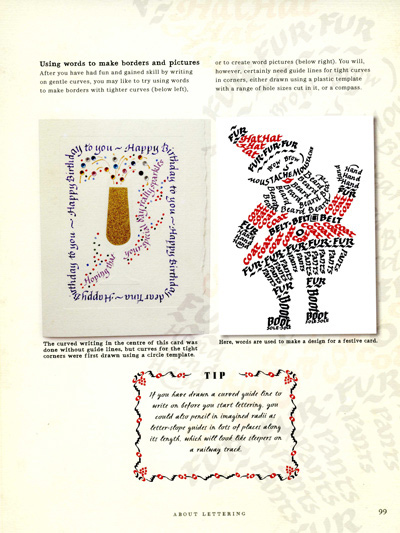
Apart from the ‘normal photos’, the designers asked for extra artwork to create page corners and borders, backgrounds and decorations. They also took elements from the images, enlarged them and screened them back for further interest, and I created the cover to match their design idea.
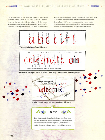 For the page on the left, the designers asked for:
- An abstact watercolour they could screen-back for the page background.
- A hand-drawn border for the ‘Note’ at the bottom.
- Small flowers to add to the ‘Note’.
- A two colour pen-drawn design to go each side of the page header – each side of the book title.
…And they’ve taken some of the rectangles from the card design and re-used them in enlarged form to add extra colour to the page and to fill some space.
For the page below, the designers have enlarged and screened-back the Santa card design and incorporated it in the background. They also asked for extra border artwork in two colours to enclose the ‘Tip’.
Publishers expect all authors to help in promoting and selling books. With this one, I hit two snags. Firstly, I tried to join scrapbooking groups on Yahoo, but I was banned from membership even before the book was published. Once it was discovered that I advocated hand lettering, other members with stores selling ‘stick on or stamp on’ products were afraid they would lose customers.
Secondly, the UK based publisher chose a distributor in Australia that no store wanted to deal with (inconvenient invoicing process and reluctant to accept returns). The distributor has since gone out of business.
The book has gained pleasing reviews:
“Any beautiful craft book may awake the desire to create something special. A detailed how-to beginning with the basics may provide the confidence to do it. To find both the inspiration and the know-how in one book is irresistible. This is not only the most attractive calligraphy book I’ve seen, it is also the only one that has answered my dumb questions (why do the folds in my cards look so amateurish?), solved my recurrent problems (how can I kick-start a pen in which the ink has dried?) and even demonstrated how to rescue – stunningly – a piece of calligraphy whose spacing I’ve bungled.
The basic alphabets are not merely illustrated, they are explained. From step-by-step photos I’ve learned how to make those stylish flourishes at the end of words. How to choose pens, or make my own from bamboo or balsa wood, how to write on a curve, make engraved letters, pop-up letters – and even how to avoid postal damage to a delicate card. (Did you know that posted letters are usually sorted through rollers?) All this in a book whose every page is a small masterpiece of design on its own subtly patterned or colour-washed background.
A marvelous gift, but do buy two copies because you won’t be able to bring yourself to give it away.”
The picture of one of the illustrations (below) shows how you can use calligraphy together with cut and sculpted paper to create designs. I’m sure it could be hung on the wall, or the technique used for other fun projects or a school assignment.
Many thanks to all those who contributed images for the Gallery section of this book: